Keen Bolden
Return to Previous Page

Project Type
Identity Design
Project Brief
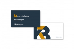
Create the look of a new company specializing in chemical distribution. Keep the visuals more conceptual, as to avoid being pigeon-holed into one industry. Build off the key concepts of Keen, Bold, and Noble. Final mark utilizes colors that stand apart from the competition and yield the 'golden standard' feel. The interwoven letterforms in the icon tie into the interwoven approach Keen Bolden brings to their clients. Extend the look to a business card.
Project Portfolio


